Design System
How this site is built.
A small, owned system: four colour roles, one gray ramp, five type sizes, and four spacing bands. Every swatch and specimen on this page renders from the same CSS variable the site ships, so nothing here is a mockup.
- Built with
- Astro · Tailwind · MDX
- Typefaces
- Poppins + Literata
- Base
- 8px grid · 18px base text
- Made with
- Claude Code · by hand
01
Foundations
Two rules sit underneath everything else. The brand green is a fill and never carries text. Text is sized for reading rather than for chrome.
Grid
8px
Every spacing and radius value is a multiple of eight.
Base text
18px
Paragraphs, cards, and lists. Small type is the exception.
Measure
65ch
Prose stops here; figures break wider on purpose.
02
Colour
One green, one gray ramp. Ratios are measured against white, or against#18181B where noted. Anything below 4.5:1 is marked fill-only and never carries text.
Brand
--color-brand
#7DB405
The signature green. Fills only — the mark, checklist circles, accents.
2.5:1 · fill only
--color-brand-dark
#6A9A04
Hover state beneath the cursor on a brand fill.
3.37:1 · fill only
--color-action
#3F7D20
The primary button. Deep enough that a white label passes AA, which the signature green is not.
5.04:1 · text OK
--color-action-dark
#356A1B
Primary button hover. Darkens, never lightens — white has to keep passing.
6.5:1 · text OK
--color-brand-text
#557D08
Green that has to be read: links, kickers, taglines.
4.86:1 · text OK
--color-brand-on-dark
#A3CE4A
Green text over a dark hero or footer.
9.8:1 · text OK
--color-brand-wash
#E2EEC8
The palest tint. Diagram fills and tinted callouts.
1.28:1 · fill only
Accent — ink blue
--color-accent
#1F4E79
Pull quotes and editorial marks. Never a primary action.
8.66:1 · text OK
--color-accent-on-dark
#84B8E4
The same role over an ink surface.
8.4:1 · text OK
--color-accent-wash
#E8EFF6
Tinted callout backgrounds.
1.19:1 · fill only
State
--color-danger
#C62828
Form and gate errors on a light ground.
5.62:1 · text OK
--color-danger-on-dark
#F87171
The same, over the ink footer and gate.
6.4:1 · text OK
--color-notice
#B45309
Advisory banners.
5.02:1 · text OK
--color-notice-wash
#FDF1E3
The background those banners sit on.
1.13:1 · fill only
Discipline chips — defined, not in use
--color-chip-build
#456507
Retired from the chips — kept defined. Ratios here are against the chip's own wash, not white.
5.55:1 · text OK
--color-chip-ai
#5B21B6
AI & Agentic. Retired from the chips — kept defined.
7.44:1 · text OK
--color-chip-vision
#1F4E79
Product Vision. Retired from the chips — kept defined.
7.47:1 · text OK
--color-chip-craft
#0F5F5C
Interaction Design. Retired from the chips — kept defined.
6.27:1 · text OK
Neutrals
--color-ink
#18181B
Headings and the secondary button label.
17.72:1 · text OK
--color-copy
#27272A
Running text.
14.89:1 · text OK
--color-muted
#52525B
Captions, metadata, supporting copy.
7.73:1 · text OK
--color-rule
#E4E4E7
Hairlines and dividers.
1.27:1 · fill only
--color-raise
#F4F4F5
Raised bands and cards.
1.1:1 · fill only
Gray ramp
A true neutral — no warm or blue bias, so it never argues with the green. The roles above are drawn from these steps.
50
#FAFAFA
100
#F4F4F5
200
#E4E4E7
300
#D4D4D8
400
#A1A1AA
500
#71717A
600
#52525B
700
#3F3F46
800
#27272A
900
#18181B
Chips in place
Chips are neutral. They were led by a coloured discipline chip, where colour meant what kind of work a study was — but the same few labels across twelve studies read as a restatement rather than a distinction, so the colour was retired and the chips became quiet metadata under the title.
- iOS
- Android
- Web
--color-gray-200 · --color-muted
- iOS
- Web
- Prototyping in Code
platforms, then extra tags
Discipline palette — defined, not in use
These four pairs coloured the discipline chip. Nothing renders them today. They stay defined and measured rather than deleted, so bringing the distinction back is a one-line change — and so the ratios don't have to be re-derived if it is.
- 0-to-1
--color-chip-build-wash
- AI & Agentic
--color-chip-ai-wash
- Product Vision
--color-chip-vision-wash
- Interaction Design
--color-chip-craft-wash
03
Typography
Two faces with separate jobs, and five sizes named for what they do rather than how big they are.
Display & chrome
Poppins
400 · 500 · 600 · 700
Headings, navigation, buttons, and every uppercase label. Geometric and confident — it carries the voice.
Reading
Literata
400 · 600 · 400 italic
Every paragraph, caption, and case-study body. Drawn for Google Books and built for long stretches of screen reading.
text-label
14px · Poppins
Uppercase kickers, metadata keys, buttons, chips
CORE STRENGTH 01
text-caption
16px · Literata
Figure captions and attributions
The vision prototype in action.
text-ui
18px · Literata
Base size. Nav, cards, lists — 1.6 line-height, no measure cap
Designed the core Intuit Intelligence experience.
text-body
18px · Literata
Long-form prose — 1.7 line-height and a 65ch measure
I bring the full stack of craft to a product.
text-lede
24px · Literata
Section standfirsts
Turning tax from software into a human-led service.
In context
Intuit
Provoking a New Vision
At the end of the season, as we iterated on Verified Pro for the next year, my provocations pushed hard on the idea of shopping for an expert, drawing inspiration from experiences like Airbnb. Then, in early May, I felt the ground start to shift. Sensing change coming, I started provoking on a bigger question: what if Verified Pro and Full Service were one product?
Verified Pro: a 0-to-1 dual-sided marketplace matching consumers with the right independent tax pro.
04
Spacing
Four bands on an 8px base. A section picks the one that matches its weight, which is how a page signals what matters without adding ornament.
band-tight
48px
Image-only interstitials that connect two ideas
band
64 → 96px
Default narrative rhythm
band-loose
96 → 176px
Results, screen galleries, case-study intros
band-hero
128 → 256px
The homepage hero and the closing ask
All but tight scale with the viewport, so a 256px band never eats a phone screen.
05
Corners
Softness scales with the size of the thing. Small marks stay nearly square so they read as precise; media rounds enough to feel considered without becoming a bubble.
--radius-mark
4px
Inline code and small marks
--radius-chip
8px
Tags and category chips
--radius-card
12px
Cards, figures, media, video
--radius-full
pill
Buttons and avatars
06
Components
Every component below is the real one, imported from the same file the case studies use.
Buttons
A dark label on the brand green, which is what lets the fill stay at full strength.
Checklist
Used for highlights, metrics, and responsibilities across every case study.
Figure
Click any figure to open it full-size. Captions carry the reasoning, not a restatement of the image.
Quote
07
Iconography
Every glyph is hand-authored inline SVG on a 24×24 box with a 1.75px stroke and round joins. Nothing is imported, and nothing is filled — a glyph inherits the current text colour, so there is no per-colour variant to keep in sync.
An icon has to say something the sentence beside it does not. Repeating one glyph down a list is the same as having no icon at all, so a list of unlike things gets unlike glyphs and an ordered list gets numerals instead.
Problem & friction
compass
No clear place to go
scatter
Fragmented, disconnected
clock
Time wasted
target
A clear entry point
layers
Many surfaces at once
calendar
A deadline
shield
Trust, reducing doubt
eye
Visibility, or a missing signal
Outcome & impact
trending-up
Growth, lift
message
Queries, conversations
repeat
Customers coming back
arrow-up-circle
Upgrades
rocket
Shipped
network
Adopted across teams
people
Customers
phone
App rating
trophy
Awards
currency
Revenue per customer
globe
Around the world
check
Done — contributions only
Craft & personal
code
Prototyping in code
book
Reading, book club
pen
Writing, composing
The tick is reserved
check is the only glyph that gets the filled green circle, because it is the only one that means “done”. It appears against contributions and nothing else — a green tick beside a problem statement says the opposite of what is intended.
Numerals over glyphs
Ordered lists lead with a large numeral. A reader wants to know there are five principles and which one they are on, and no icon carries either fact.
08
Motion
Motion explains state; it never performs. Nothing animates on entrance, nothing delays reading, and every duration here belongs to a hover or a disclosure the reader asked for.
--duration-fast
220ms
Colour and opacity — links, nav, button hover
--duration-base
380ms
Disclosure, and the confidential gate revealing a section
--duration-slow
600ms
Image scale on a card hover
--duration-page
420ms
Page transitions — the card morphing into a case-study hero
--duration-reveal
800ms
A band fading and rising into view on scroll
Hover the card
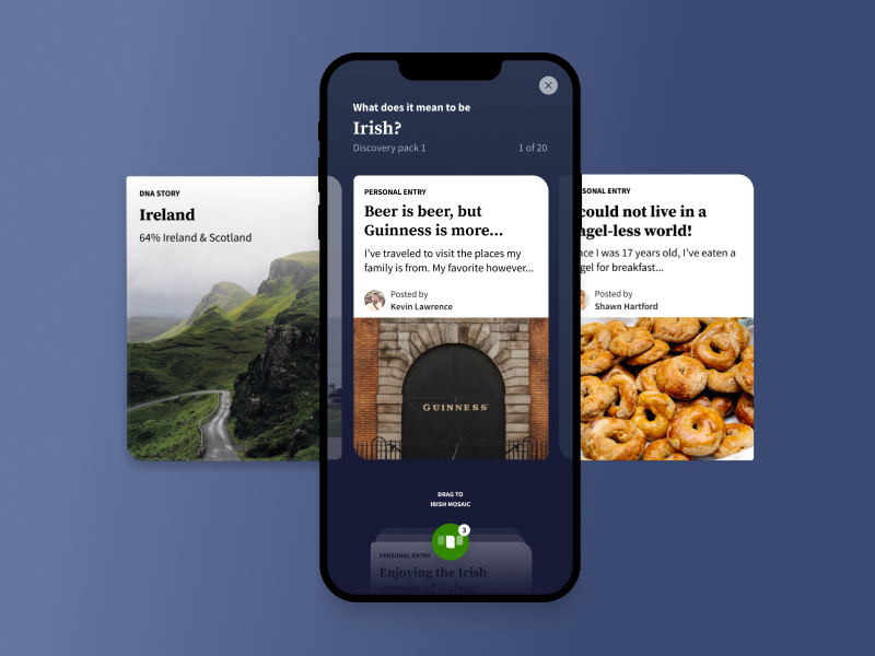
One easing curve — --ease-out — and all of it yields entirely when the reader has asked their system for reduced motion.
09
Principles
Six commitments the rest of the system answers to.
01
Contrast is a constraint
Every colour pair carries a measured ratio, and nothing below 4.5:1 is allowed to hold text. The green never had to change — the label did.
02
Type is sized for reading
Running text is 18px. Small type is rare and has to earn its place, because a portfolio that is hard to read is not finished.
03
Rhythm carries hierarchy
Four spacing bands let a page signal what matters. Uniform spacing is a way of saying everything is equally important, which is never true.
04
Prose has a measure
Text stops at 65 characters and figures break wider on purpose. That contrast between narrow reading and wide imagery is what makes a page feel composed instead of stacked.
05
Two typefaces, two jobs
Poppins states and Literata explains. Reading text defaults to Literata so a new paragraph is right without anyone remembering a rule.
06
Motion explains, never performs
Nothing animates on entrance and nothing delays reading. Every transition belongs to a hover or a disclosure the reader asked for, and all of it yields to reduced-motion.
10
How it was made
With AI tools, by hand. The distinction matters, so here is what each half did.
What the tools did
The previous site was a purchased theme with jQuery underneath. This one is Astro, Tailwind, and hand-written TypeScript, and most of that code was written in conversation with Claude Code: I described what a section should do and why, it wrote the component, I read every line, and we argued about the parts that were wrong. The password gate that encrypts case studies at build time, the view transitions, the scroll reveals, the PostHog wiring that kept four years of dashboards continuous across the rebuild — all of it came out of that loop.
It also did the things I would have skipped. It measured whether a logo's ink sat on a heading's cap line instead of eyeballing it. It found that three of my company logos carried transparent padding inside the file. It walked the site as a design recruiter and again as a hiring manager and told me which sentence a recruiter would trip over. It read my analytics dashboards and checked that every event the new site sends is one a chart is waiting for.
The sharpest thing it did was on the leadership page. I asked how a recommendation from a designer who reported to me compared with the principles I had written, expecting agreement. What came back was that the theme he spent the most words on, putting other people's names on the work, was the one thing none of my principles claimed. I had been proving it in his voice and never saying it in mine. There are seven principles now.
What I did
Every decision on this page. The four colour roles and the rule that green never carries text. The type scale. The choice to replace illustrations with numbers, and which numbers. Which of the twenty portraits went where, and which two stayed gated. The copy — including the parts the tools drafted, which I rewrote until they sounded like me, and cut when they didn't.
I also did the part that doesn't show: saying no. A blob behind every case-study hero was built, deployed to staging, and removed within the hour because it competed with the work. That is the job — not producing more, but knowing which of the things that got produced should exist.
And the editing that carried a risk. The leadership page is built out of performance reviews and an engagement survey, which are my former employer's documents and not mine to reprint. What appears there was my call line by line: quotes carry titles instead of names, the survey shows movement rather than scores, and one quote came out altogether once I worked out it was the same person already speaking further down the page under his own name.
If you are hiring for someone who ships in working code, this page is the evidence. View source.