Overview
Our goal with Make Twiter Easy was to tackle the known usability problems that were core to the Twitter experience. This included things like where the Reply button on a Tweet would take users; does it allow a user to reply or does it allow users to view the replies to the tweet? We also tackled making it easier to know how to get to Tweet Details and the conversations, as well as allowing users to view more of a conversation (replies) directly on the Home timeline. These usability issues have been surfaced at Twitter from multiple years of user research.
About
Background and Team
When I joined, the Design Foundations team, including about 8 designers, were working on the core usability issues with Twitter. I took this work on within week 2 to wrap my arms around it and lead a new set of thinking and driving forward a new direction. I lead the new direction and execution with collaborations with PM and ENG.
Core projects
Make Twitter Easy
Make it Easy to Get to Tweet Details
How can we enable and encourage customers to view the conversation around a Tweet to ultimately help them feel comfortable contributing to the conversation. Customers don’t know how to get to Tweet Details for the conversation & replies. There is no visual affordance or interaction, and the Reply button only adds to this confusion.
Solution
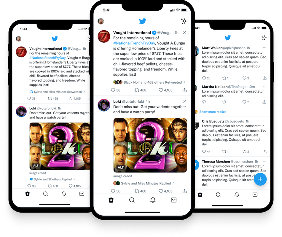
While exploring past research around context lines we came away with new Insights and fresh thinking around context lines. Research showed that user’s only view context lines after the read the Tweet itself and usually only when they don’t like the content and want to see why it was shown to them. Further, these context lines were not mentally or visibly connected to the social actions a user could take on a Tweet.
So, we found a way to better utilize context lines with a new placement, icon, and link, allowing a visible, connected affordance to get to Tweet Details.
Make Twitter Easy
View More Conversations From Home
Customers tended to spend the most amount of their time on the Home timeline surface. When customers did visit the Tweet Details, they wanted to “read the room” first, to see if the conversation was worth following. This caused a lot of back-and-forth navigation which was distracting and could easily cause users to abandon Twitter altogether.
Solution
Our solution was to enable a new interaction on Twitter allow users to see additional replies to a Tweet without having to go back and forth to Tweet Details. In this design we explored allowing users to expand a conversation, showing the top replies, on Home directly, without having to load a new screen or go back and forth. This allows users to more quickly understand if they want to spend time with the conversation or move on to additional content.
Results
Through fresh thinking, novel design approaches, and a deep understanding of customer problems our experimentation showed very positive results across all MTE projects. Along with additional projects my design impact at Twitter had an overall positive affect on our core metrics.
Metrics
Disclaimer: These are results from experimentation. Since EM took over Twitter none of these projects have yet to see the light.
This is a high-level overview. In interviews and presentations I go deeper on strategy, process, and my direct contribution — get in touch if you'd like to see it.