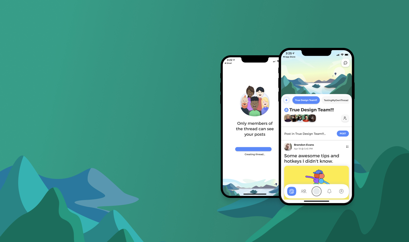
A new social network, private by default, for friends and family.
I joined True just after an initial launch of the app, which still lacked many features. 
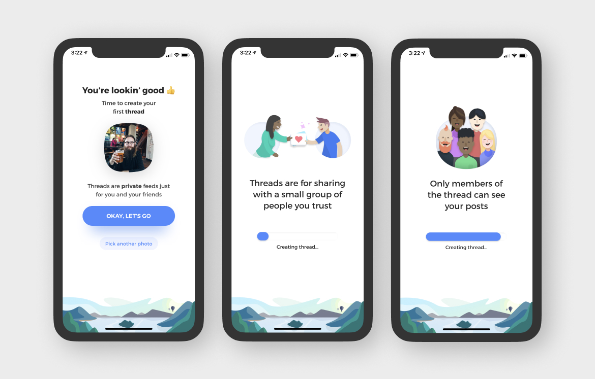
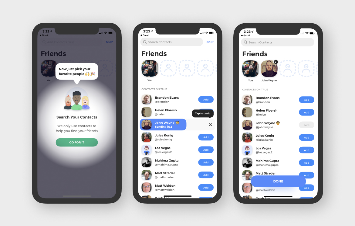
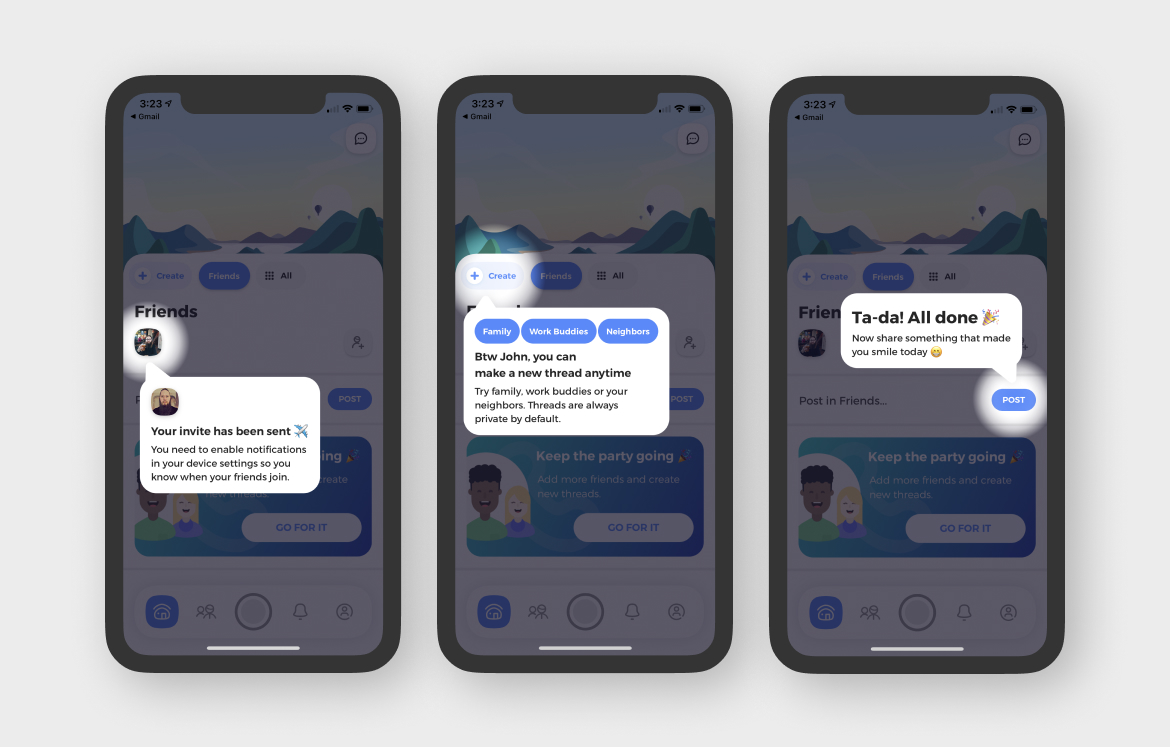
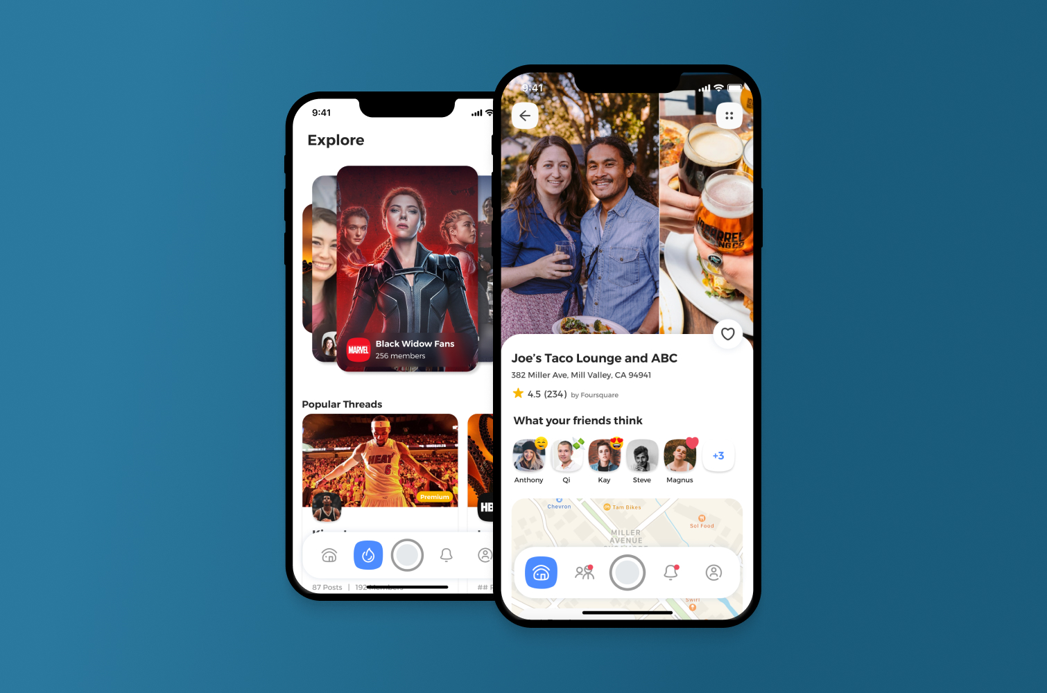
True’s concept was to take the social media model and make it private by default, so that a user’s posts are not public. Further, we wanted to change the businesses model of advertising people’s data. True allows you to connect with friends, family, and people who share similar interests with you.
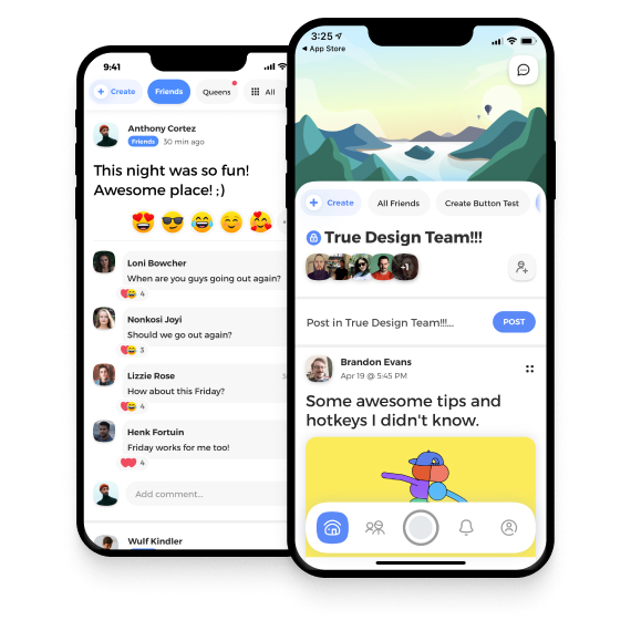
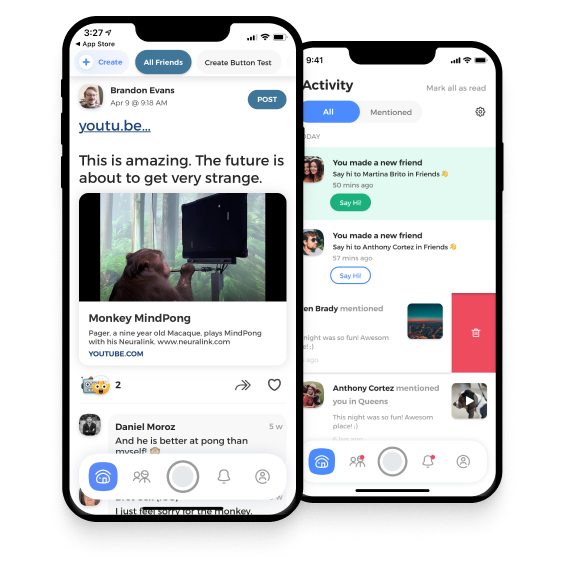
With our main feature Threads, people can post to a feed with a specific topic or a small group of people. All posts are private to just the people within the thread. With full functionality around commenting, replies, reactions and more, True provided an alternative to traditional social media.
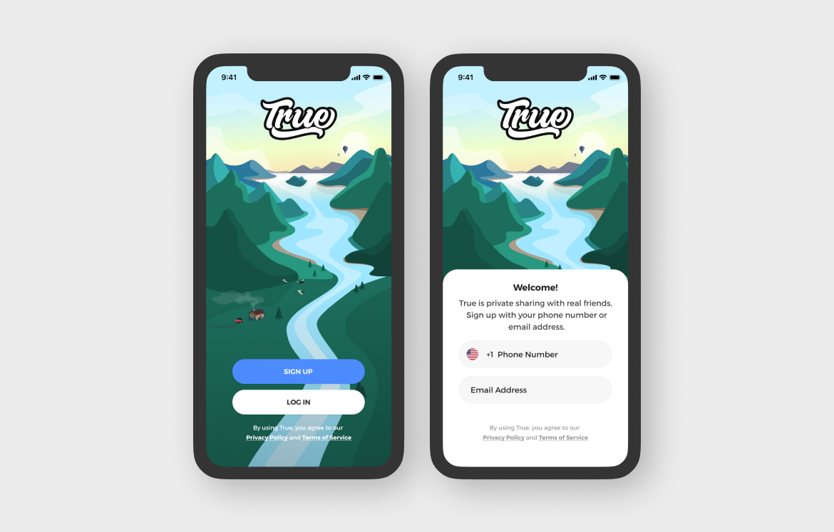
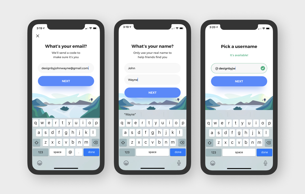
Lead and owned all design activities, worldwide (U.S. & Estonia)
Grew the design team from 3 to 6+ designers
Responsible for the overall strategy, vision, and design across all platforms
Implemented organizational changes and new processes for efficiency and predictability
Lead product and design teams from being behind to a six-month lead time of new products and innovations
Added a suite of new features for engagement and sharing including reactions, replies, photo and gif sharing, inviting friends, easy creation of new threads, and many features that have not yet been released
Onboarding Re-Design
One of the main projects I undertook was to redesign the user onboarding experience to help more users sign up for the network, as well as to help users better understand the value of the product. The existing onboarding experience lacked context, failed to explain why it needed certain data, and had a lot of basic usability problems. While we had some users downloading the app, they would abandon it during the onboarding process.
Problem Statement
How do we showcase the value of True (private & authentic social) and get users toward the right actions?
Once the app is downloaded, we present a splash screen with the True branding. When users tap on Sign Up, we provide a little blurb about True.
After the personalized opening screens, users input their email and information. Each step where we ask for information, we tell users how and why we need that particular information.
Users then upload a photo of themselves. A real name and photo help people to be more authentic and real. We tweaked the copy towards a fun and friendly tone. Following the photo, we start making a user threads (in the background) and take a moment to showcase the value of our product with two screens and a loading bar. This helps users feel the app is working for them, and keeps people engaged with the two screens of content.
A part of any social network is inviting your friends and family. We designed a custom selector with motion design and a ‘shelf’ of friends that fill up as you invite them. We wanted people to invite at least 3 friends, so we designed “empty” spaces to encourage this. Having at least 3 friends greatly increases chances that people will have friends to engage with on our app.
After the onboarding, our CEO thought it was important to teach people how to utilize our product. I disagreed. So we launched this feature to test it’s use and conduct user research to see how much education we might need. These three screens comprise the entire education and focus on the essentials only. Users may also quickly tap the screen to flow through the education modules. Each is personalized to the individual user.
Social means replies, commenting, and having discussions and reactions to content people post. We focused the design of posts to provide a fun feeling, pushing our reactions to create a fun/friendly experience. Each reaction also animates and has a custom transition when users leave a reaction, along with a custom notification with copy specific to each reaction type.
Replying to other people’s comments also creates discussions and engagement, authentic to how people talk in “real life”. People can “@ mention” others to reply, as well as leave reactions to specific comments and replies.