Overview
I joined Twitter in May of 2022, just before the Elon saga began. As a Senior Staff Product Designer, I was responsible for the Home Timeline, Tweets, and Tweet Details (the core of Twitter). My role was to lead these areas from a strategic point of view while also directly contributing design artifacts. I collaborated closely with a Staff Product Manager, and Engineering Managers for various projects.
Twitter is unique in that Tweets can be quite small on screen with several Tweets being viewable at the same time. This makes time tracking per Tweet impossible because we would not know which on-screen Tweet a customer was actually viewing. Further, customers of Twitter would often not interact with individual Tweets and would instead just scroll the timeline. Without a lot of interaction, it also becomes hard to tell which Tweets or Recommendations a customer does enjoy and would like to see more of. In order to help boost our recommendation algorithm, we wanted to provide a very lightweight, one-touch interaction for customers to tell us they did not enjoy a particular Tweet. Internally, we called this Project Nah.
Project Nah

Solution
We needed a lightweight, fast, one-touch experience allowing customers to hide or dismiss Tweets they didn’t enjoy and sometimes provide tell us why they didn’t enjoy the Tweet.
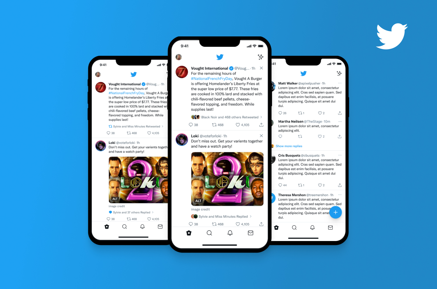
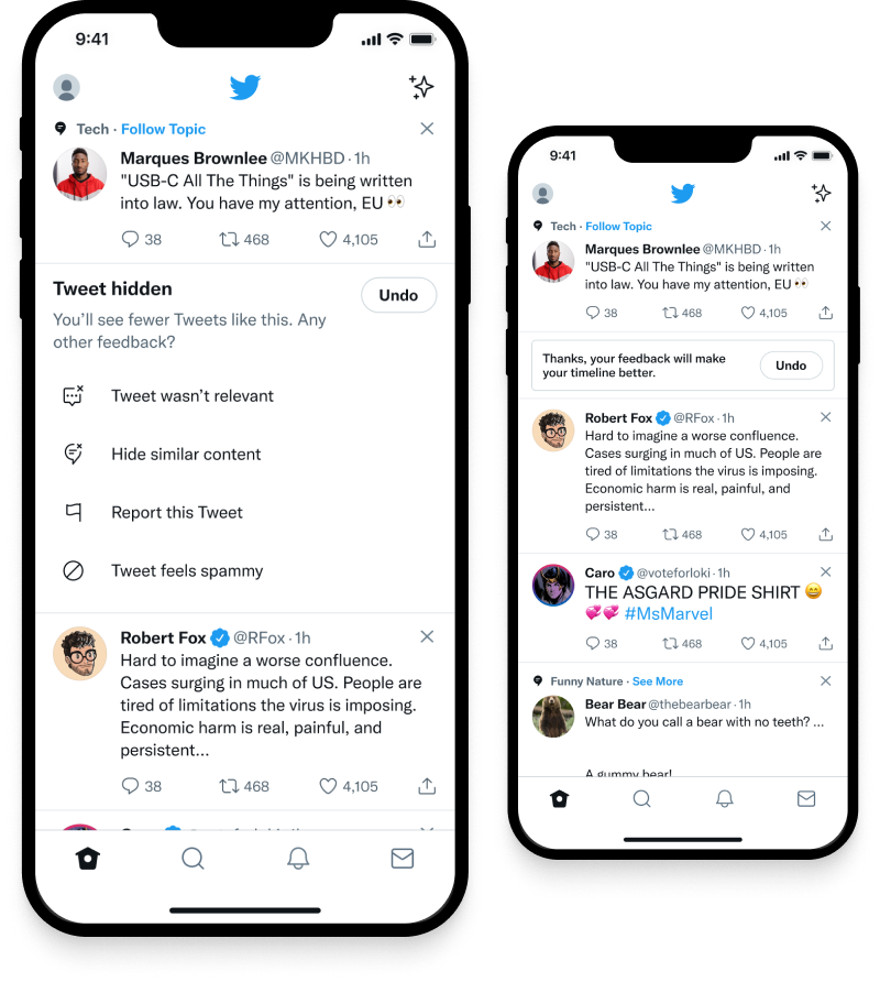
We designed a simple X icon and interaction which replaced the Context Menu Icon in the upper right corner of recommended Tweets. Tapping on this new Dismiss Icon, which we went through several iterations of, would replace the Tweet with what we called a Leave Behind Menu. This menu had up to 5 options for additional actions a customer could take. These options were contextual based on the Tweet and Surface a customer was one like Home, Tweet Details, or Notifications.
The Leave Behind Menu would stay on screen for 3 seconds allowing a customer to take additional action, but would then automatically close and show a feedback state if the customer took no action. This allowed for a one-touch interaction but also provided customers with the ability to tell us more. In experimentation, this new option increased personalization feedback from customers by a whopping 7.26% and allowed for much great control over one’s own Home Timeline.
Home Timeline
On the Home Timeline, we wanted to allow customers to quickly dismiss recommended Tweets they didn’t like to customize their recommendations. Additional options in the Leave Behind Menu allowed customers to further provide Twitter with information and allowed for crucial safety actions such as Mute, Block, and Report.
Replies / Tweet Details
When customers are viewing what we called Tweet Details, they are seeing the conversation, Replies, around a given Tweet or additional Replies (threads) from the Author. On Tweet Details, customers are exposed to a large swath of Twitter customers, many of whom that customer may not be following. It is on this particular surface that much of the negative experience of Twitter comes through. So, it was particularly important that we allowed customers to Dismiss Replies and provide additional rationale and safety features.
Notifications
Notifications at Twitter would sometime show Recommended content based on a customer’s behavior, follows, or content they have interacted with. On this surface, we wanted to allow customers the ability to better shape what Recommended Notifications they disliked through the Dismiss action. With Notifications there are not many Safety concerns, so those options were contextual based on the Notification that was shown.
Explorations
While we ultimately chose a design that replaces the Tweet onscreen, we also explored a variety of alternates. The second most favored design utilized a minimal dialog sheet with similar options. This design was favored due to the hypothesis that we would get more information from more customers by presenting the options in fashion that made it appear it was necessary to chose a reason before moving forward. Ultimately we landed on the above design to keep customers in context and allow for a quicker, more light weight interaction.
Icons
We also explored a variety of different icons for the Dismiss action. We decided to utilize the X icon in the end due to it’s familarity from our customers and competitors.
Specifications
Following are some examples of the level of detailed specifications provided to Engineering alongside 3 different prototypes. The specifications included things like quick Redlining, Interaction Specs, Components to use, and Motion Design specifications.
Results
Through fresh thinking, novel design approaches, and a deep understanding of customer problems our experimentation showed very positive results across all Twitter projects. Along with additional projects my design impact at Twitter had an overall positive affect on our core metrics.
Metrics
+7.26%
increase in personalization feedback from Twitter Home
across millions of global users
This is a high-level overview. In interviews and presentations I go deeper on strategy, process, and my direct contribution — get in touch if you'd like to see it.